
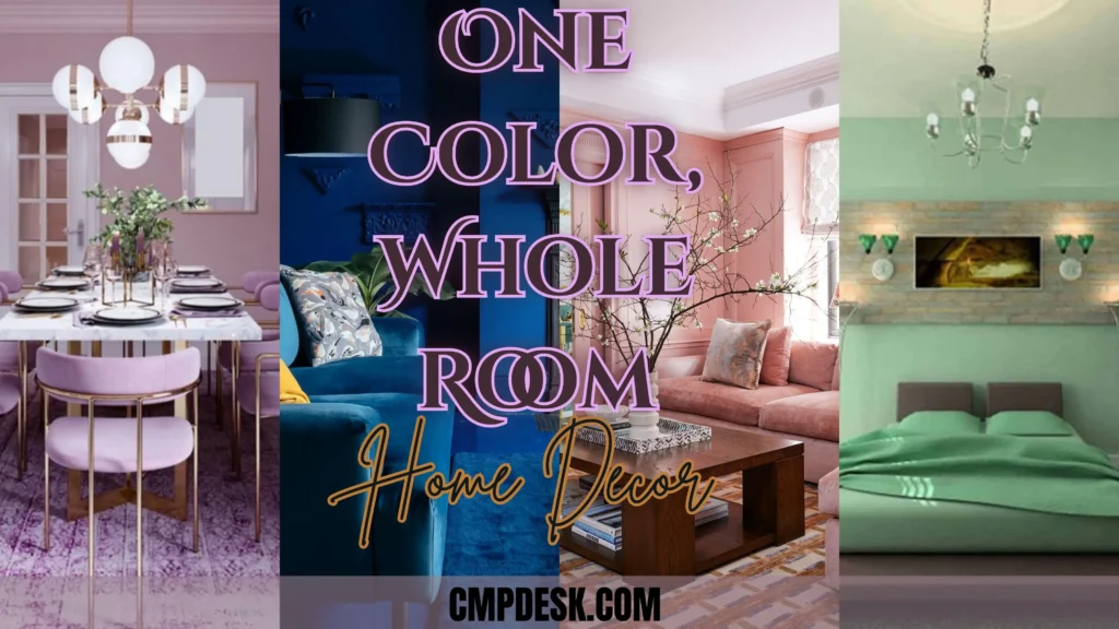
Master monochromatic home decor ideas! Learn how to style stunning, single-color rooms that feel cozy, luxurious, and perfectly curated.
1. Master the Art of Tone-on-Tone Layering
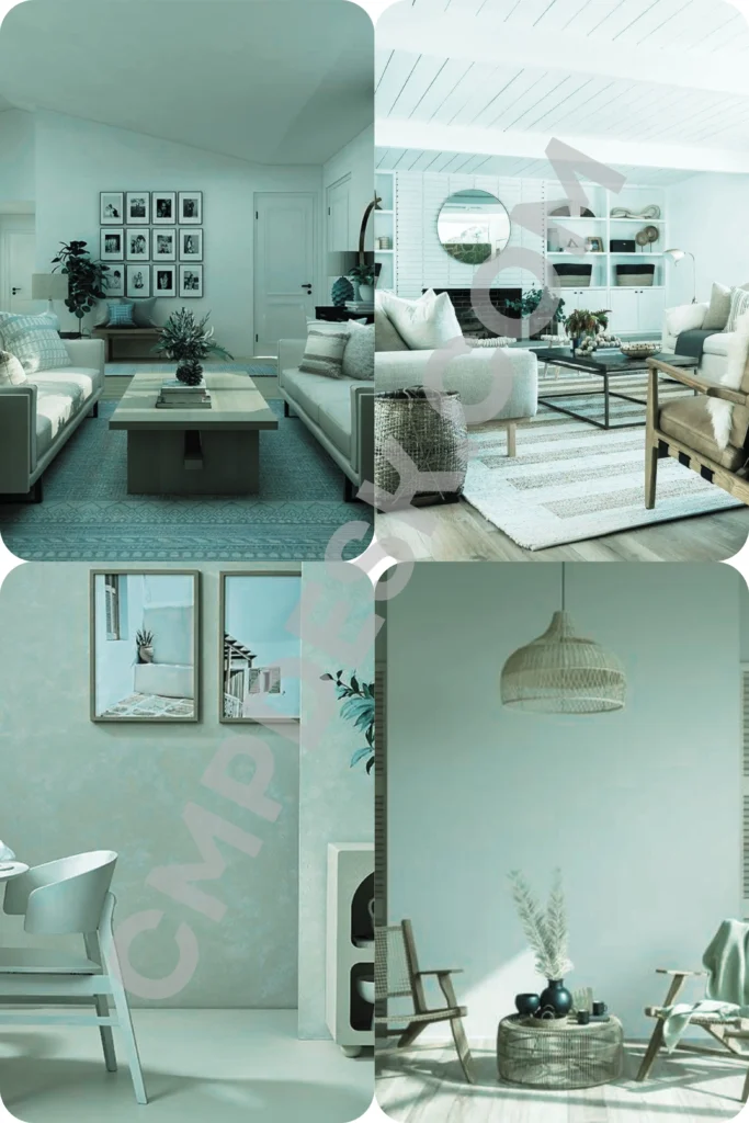
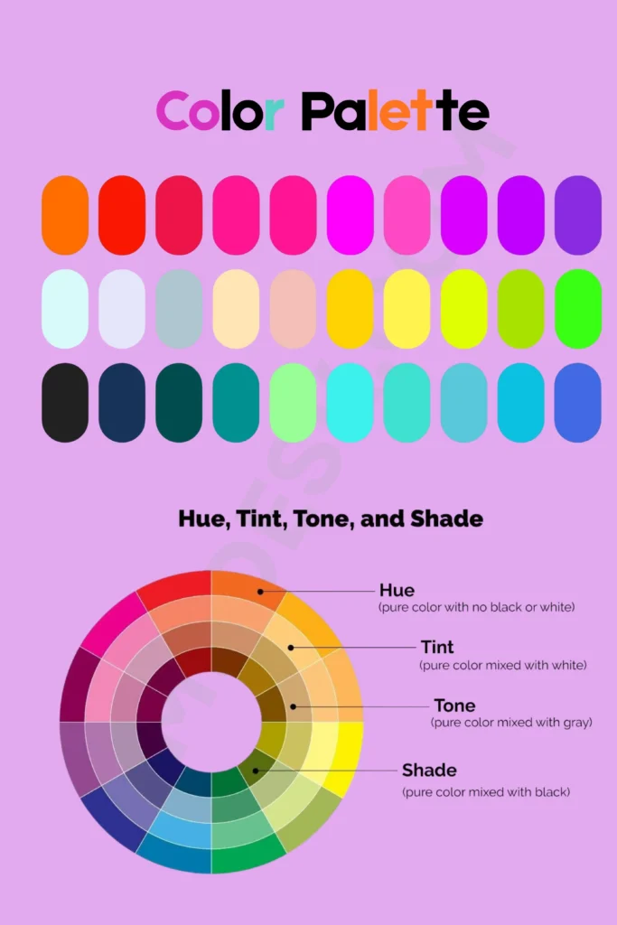
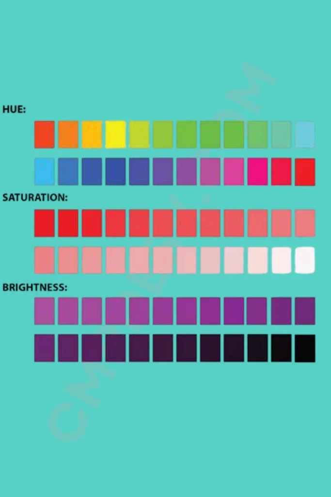
Going monochromatic does not mean your room should look like a giant bucket of identical paint exploded inside it. The real magic happens when you use various shades, tints, and tones of your chosen anchor color. This subtle shifting of shades adds incredible depth and prevents a room from looking like a flat box.
If you choose a calming blue, mix in deep navy, soft slate, and light sky blue tones throughout the space. Layering your tones naturally guides the eye across the room, making it feel intentionally designed and incredibly high-end.
- Vary the depth: Put your darkest shade on the largest surface, like an accent wall or the sofa.
- Keep it balanced: Use lighter tints of the same color on your curtains and ceiling to bounce natural light around.
- The 80/20 Rule: Let 80% of your room stay true to your main color family, and use the remaining 20% for crisp neutrals like white or wood tones.
Pin-Worthy Design Tip: “Monochromatic isn’t about using one single paint swatch; it’s about exploring the beautiful depth of an entire color family.”
2. Introduce Rich Textures for Visual Interest
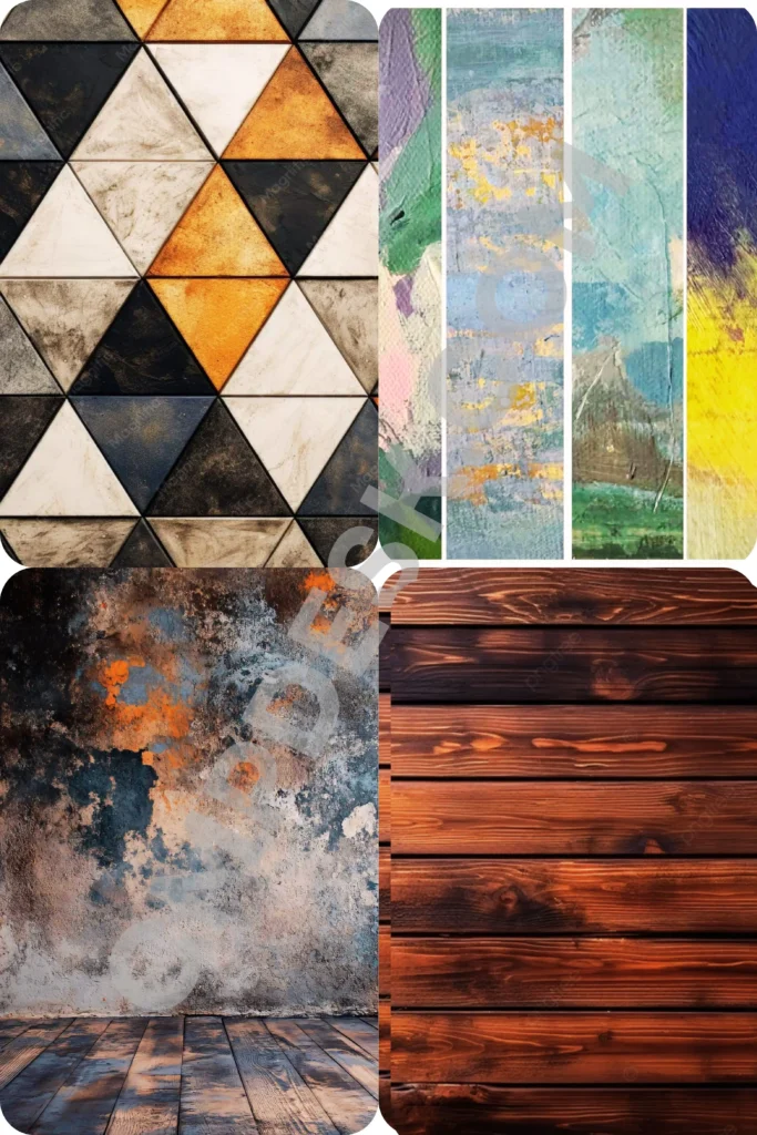
When you remove a heavy mix of colors from a room, texture becomes your absolute best friend. Without contrasting colors, your eyes rely on tactile variations to separate different elements. Introducing a mix of textures keeps a single-shade space feeling cozy, alive, and layered.
Imagine a stunning pink living room. You can combine a plush velvet sofa with a heavy textured boucle armchair, a glossy ceramic coffee table, and a chunky knit throw blanket. Even though every single item belongs to the same pink family, the space feels dynamic and visually interesting because of the varied materials.
- Matte vs. Glossy: Pair sleek lacquer trays with matte-finished clay vases.
- Soft vs. Structured: Place a soft, shaggy rug under a clean-lined wooden or metal table.
- Natural Elements: Don’t forget that woven rattan baskets or light linens add a gorgeous organic texture to any color theme.
Pin-Worthy Design Tip: “Texture is the secret language of monochromatic design. When color stays quiet, texture speaks volumes.”
3. Go Bold with High-Contrast Saturation
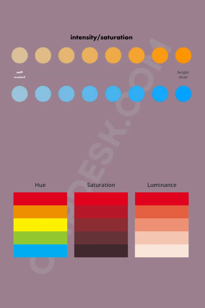
If you are a fan of drama and moodiness, deep color drenching is exactly what your home needs. Don’t be afraid to choose rich, saturated hues like emerald green, charcoal grey, or deep royal blue for your monochromatic adventure. This technique works beautifully to create an intimate, cozy atmosphere.
- Paint the trim: For a truly seamless look, paint your baseboards, doors, and crown molding the exact same color as your walls.
- Incorporate metallic accents: Saturated rooms pop beautifully when paired with warm brass or sleek chrome hardware.
- Embrace the dark side: Try this in a smaller powder room or study first if you are nervous about committing a large room to a dark color.
4. Play with Patterns in the Same Color Family
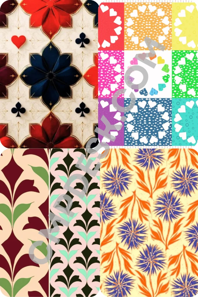
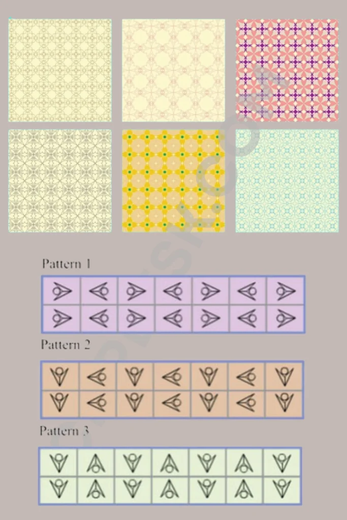
Think patterns are off-limits in a single-color room? Think again! Incorporating patterns is one of the best interior design styling strategies to break up solid blocks of color while keeping the space cohesive. The key is ensuring the background and foreground of the pattern stay within your chosen hue.
For a serene, tone-on-tone bedroom, you can use a subtle geometric wallpaper that features sage green shapes on a mint green background. Pair this with a striped duvet cover in the same color family. Because the color palette is controlled, the patterns will not clash or overwhelm your senses.
- Vary the scale: Pair a large-scale botanical print with a tight, small-scale herringbone pattern.
- Stick to the theme: Keep your patterns geometric, floral, or abstract to match the overall vibe of the room.
- Use accent pillows: Patterned throw cushions are an easy, low-risk way to test prints in your monochromatic space.
Pin-Worthy Design Tip: “Patterns don’t disrupt a monochromatic room; they give the eye a delightful playground within your favorite color.”
5. Harness the Power of Statement Lighting
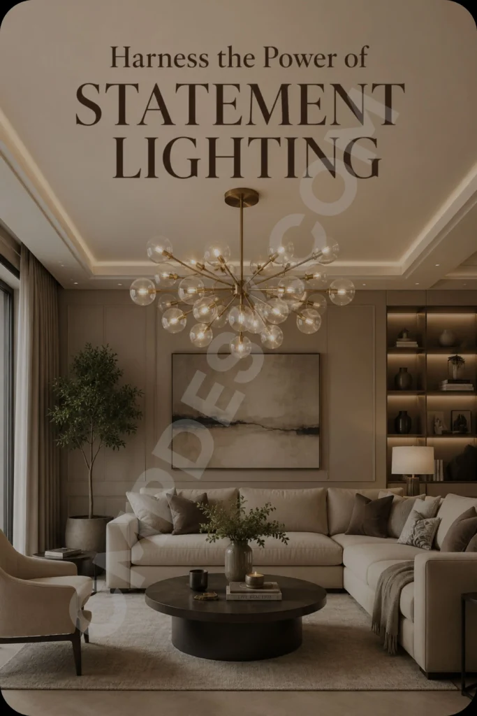
Lighting behaves completely differently in a monochromatic room. Because the surfaces are all in the same color family, shadows and highlights become much more pronounced. This means you can use lighting to create beautiful gradients across your walls and furniture naturally.
Avoid bright, clinical overhead lights that wash out your hard design work. Instead, focus on warm, ambient lighting. Place lamps at different heights to cast soft pools of light, which naturally creates lighter and darker pockets of your chosen color throughout the evening.
- Use warm bulbs: Soft white LED bulbs (around 2700K) keep your monochromatic colors looking warm and inviting.
- Pendant lights: Hanging lights cast beautiful downward glow patterns that highlight your room’s textures.
- Sconces: Wall-mounted fixtures add an architectural element that elevates single-color walls.
Call to Action (CTA)
Are you ready to try color drenching in your home, or do you prefer mixing a ton of different shades together? I would love to hear your thoughts! Which color would you choose for a single-shade room transformation? Drop a comment below and let’s talk about your favorite design palettes!


Pingback: 7 Genius Home Decor Ideas to Transform Your Space on a Budget - CmpDesk